AppDynamics Experience Journey Map
- Feb 1, 2021
- 5 min read
Updated: Mar 1, 2021
Populate the most impactful app user journeys on business, identify the performance issues, and help explore the possible remedies.

*Awarded as the CRN’s 2020 products of the Year in the business intelligence/analytics category, beating Splunk, Tableau, and Microsoft Power BI.
Project Background
Apps are getting more pervasive than we are aware of in our daily lives across a variety of scenarios: e-commerce, in-store assistance, restaurant menus, vending machines or kiosks, etc. By analyzing the users journeys and conversion of these apps, business owners can understand more about their business performance.

So, how did business owners analyze their apps before AppDynamics (AppD) released Experience Journey Map (ExJM)? They use traditional application performance management (APM) tools to collect user session data, and most of them just build journeys or conversion funnels based on their gut feeling or trial-and-error.
"Are you telling me we only sold 2 items during that time?" "... No..., I am telling you only two sessions made it to the end of the funnel. That's what data said, and maybe this is not the right path." "So I expect you can tell me what the right path is." "... OK..."

Instead, ExJM provides the answer to this fundamental question right off the bat by automatically visualizing the top user journeys with the largest volume. Business owners are therefore guaranteed they can invest their effort and resources on the right part of their apps, and even use it as a bridge to correlate the application-level updates and issues with the business impact.
I am the design lead of ExJM to conduct an iterative end-to-end design process which involves cross-functional efforts from user research, product management, front-end and back-end engineering, and marketing team.
Problem Discovery and Definition
"We need to show the most popular points of interest, the end-to-end paths in between, and finally the conversion along the paths."
Our user research team and I conducted a series of interviews with both our customers and AppD specialists to identify major challenges in the user journey exploration process. First, a bird-eye view of the most popular pages or screens, and the traffic in between, during certain time frames, is the foundation. It is quite similar to how you figure out the most popular points-of-interest on Google Maps to either avoid the traffic or, on the contrary, join the crowd.

Some of the customers wanted to move forward to find out the end-to-end journeys based on that foundation, especially when they had some user journeys in mind based on "gut feeling" or "common sense," and would like to validate them.

Some business owners with more technical skills could manually aggregate user session data based on pages or screens each session visited. It would already take a lot of effort from them, but it was just the first step of business analysis.


The next step and the most time-consuming and labor-intensive step: visualizing the journeys and conversions to share the knowledge. They either used AppD's built-in custom dashboard feature,

or used external data visualization tools, which was also not AppD is looking for, since AppD wants to provide a one-stop shopping environment, not just a data reservoir for AppD's customers to grab and go.

The Minimum Viable Product (MVP)
We need to deliver the foundation first, and potentially the ideal visualization should fit into both the most popular points-of-interest and end-to-end journey scenarios.

Traditional Sankey Diagram
Covered/highlighted attributes: 1. Flow direction & sequence
2. Traffic volume
Pros:
1. It incorporates the flow analogy
2. Can fit both the most popular PoIs scenario and end-to-end path scenario
Cons:
1. It contains only the flow direction, visiting sequence, and traffic volume
2. Hard to differentiate if it is for the most popular PoIs or end-to-end path scenario

Modified Sankey Diagram
Covered/highlighted attributes: 1. Flow direction & sequence
2. Traffic volume
3. Time spent on a page/screen
4. Page/screen response time 5. Loop on one step or between multiple steps (inspired by Minard's Napoleon's invasion of Russia, but in 3D fashion)
Pros:
1. It incorporates the most attributes at the same time
Cons:
1. Too complicated to follow.
2. 3D Loop definitely stood out but hard to comprehend.
3. The tiny difference of the band width clutters up the visualization.

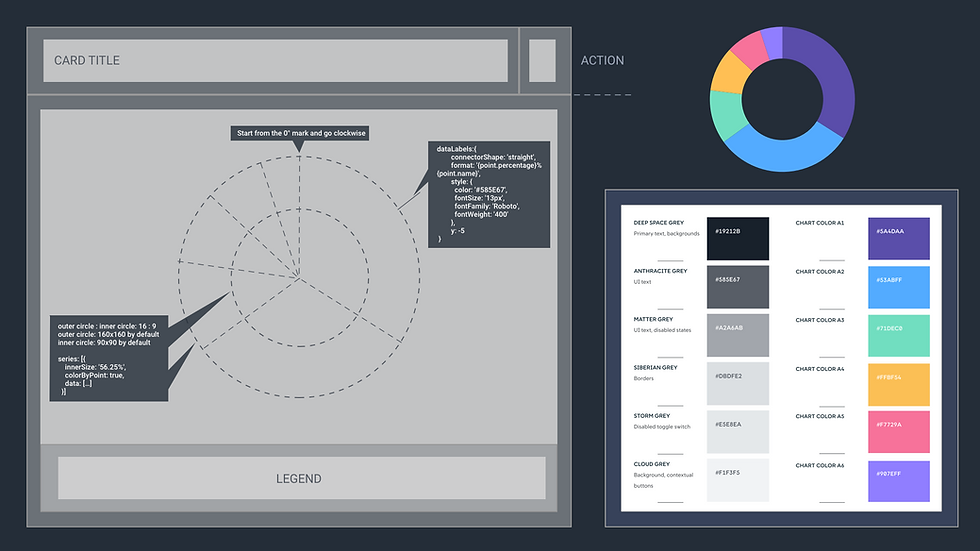
Sunburst
Covered/highlighted attributes: 1. End-to-End flow only 2. Flow direction & sequence
3. Traffic volume
4. Page/screen response time 5. Loop on one step or between multiple steps (by repeating the steps)
Pros:
1. Specialized for end-to-end paths by its nature.
Cons:
1. For end-to-end paths only.
2. Won't scale well when more journeys share the fixed size of the whole circle.
3. The size of each wedge is limited and gradually decreases, making it hard to interact with or even just to see them.
Strings of pearls Covered/highlighted attributes: 1. Flow direction & sequence
2. Traffic volume
3. Spent time on each page/screen
4. Page/screen response time 5. Loop on one step or between multiple steps (by repeating the steps)
Pros:
1. Customers are more familiar with this format, since they have already built their own journey maps in custom dashboard in a similar format 2. More room to show the loops
Cons:
1. Time spent on steps and conversion are displayed in text and require more effort to compare

AppD Flow Map Style
Covered/highlighted attributes: 1. Similarity to AppD's existing flow map for entity topology
2. Volume percentage from the total traffic 2. Flow direction & sequence, which AppD Flow Map does not have
3. Traffic Volume
4. Time Spent on each page/screen
5. Page/screen response time 6. Loop on one step or between multiple steps (by repeating the steps)
Pros:
1. Customers are familiar with this AppD flow map format 2. More room to show the loops
Cons:
1. The flow is hard to follow, even with the arrows on the traffic
2. Proportional size of each step without a predicable alignment is hard to follow as well
3. Hard to figure out where to focus on at the first place

"Left to right, top to bottom, and card flow map on a grid system."
Less is more: customers would rather to see just two or three key attributes clearly with less visual noise and more visual alignment.

Replace circles with cards to display metrics for steps in the journey provides more visual alignment.

And users can adjust how they want to highlight those issues on the fly

Transformation to End-to-End Paths
At this moment, the transition in between only represent a subset of the next step. AppD's customers are looking for more insight, like how their app users are converted in general from the start to the end of the journey. I worked with front-end and back-end engineers closely and decide to apply Trie data structure to the underlying data.

And it can still be visualized perfectly in the same format we had in MVP.

And by its nature the end-to-end paths can be transformed to conversion funnels, providing more levels of details, like drop-off breakdown based on performance issues, traffic that didn't make it to the next step in the funnel but still stayed in the app, etc. This is especially useful for business analysts to tell whether the conversion was impacted by low software performance or other issues like the campaign flow, page design, business value, etc.

Users can choose to turn on/off particular journeys, choose to focus on a particular performance category, and still have access to the underlying data with filtering criteria applied to start drilling down to a particular problem.


link link link link link link link link link link link link link link link link link link link link link link link link link link link link link link link link link link link link link link link link link link link link link link link link link link link link link link link link link link link link link link link link link link link link link link link link link link link link link link link link link link link link link link link link link link link link link link link link link link link link link link link link link link link link link link link link